Adding some style to my minimal Micro.blog theme
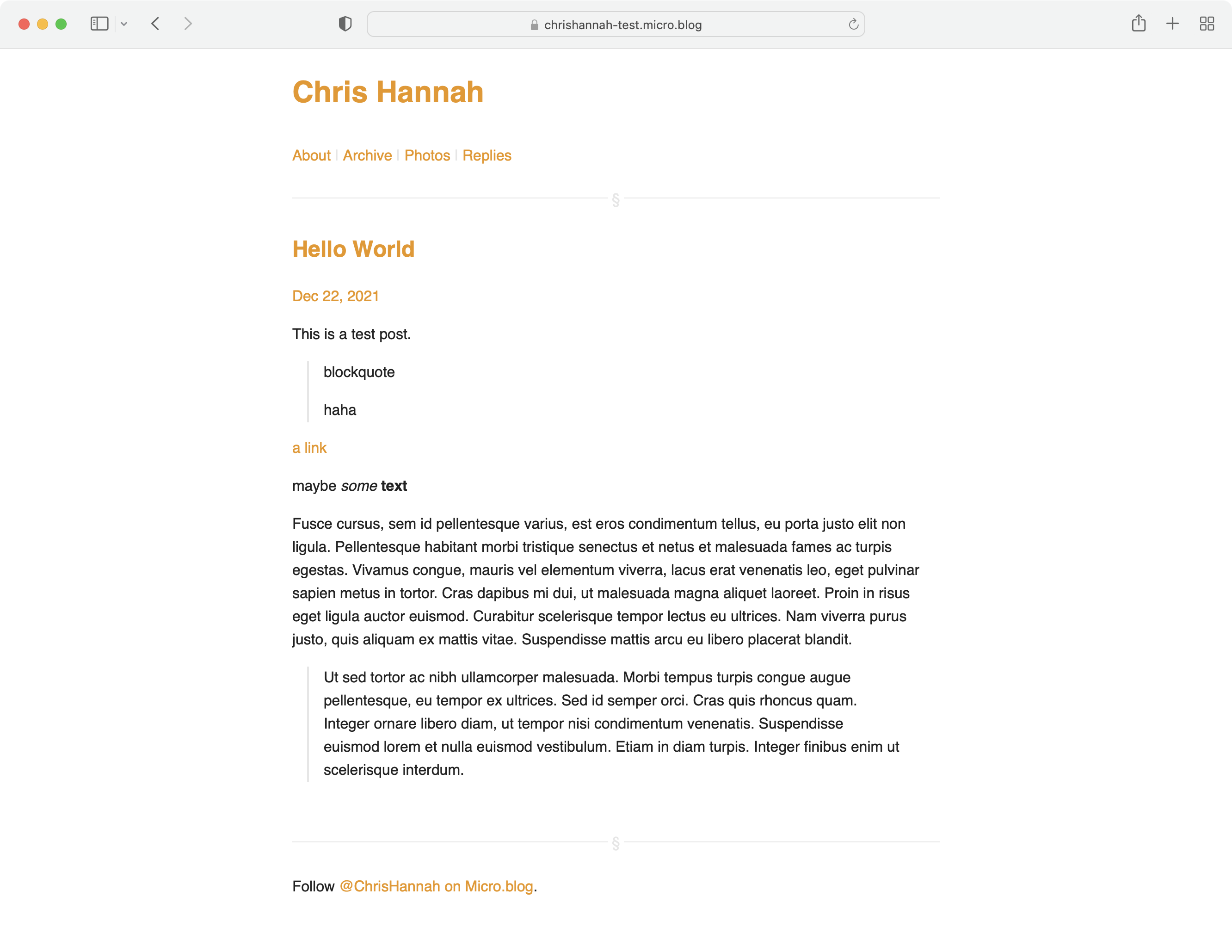
#I’ve added minimal CSS to my new Micro.blog theme that I’ve started to work on.
It adds:
- Better spacing for most elements.
- Single column layout.
- Stylised
hrelements to split header and footer from main content. - Sets
font-familytosans-serif. - Dark mode support.
- Horizontal menu with spacer between items.
- Lefthand border for
blockquoteelements. - Styles all links with an accent colour and no
text-decoration.
In it’s current form, I’m happy with everything except the link colours. For those I’m conflicted whether it should be one colour everywhere, or the default browser colours.
It should be ready for use, but before I start claiming that it’s officially ready, I just want to test a few more things like photo pages, code blocks, and maybe comments.
However, if you would like to test it right now, you can find the theme on GitHub.
