Comparing the UK COVID Test Data Against the Expected Rate of False Positives
#I heard an MP mention the other day that as the number of positive cases drop here in the UK, the data will become more unreliable because of the expected number of false positives. While our cases have been relatively high it’s not been a problem, but with the number of tests that we are performing each day, low numbers of positive cases may not tell the whole truth.
As per the ONS, we know that the rate of false positives of the PCR test is between 0.08% and 0.4%. I haven’t found concrete guidance on the false negative rate. However, over the pandemic I’ve seen reported from scientists and politicians that if you compare the two common tests used in the UK, the PCR and the lateral flow tests, the PCR tends to produce more false positives, and the lateral flow more false negatives.
Putting that aside, I decided to use the UK governments data on testing and positive results and see how everything looks. Luckily, the data includes the number of PCR tests alongside the total number of tests for a given day. So I could apply the false positive rate to the PCR tests only.
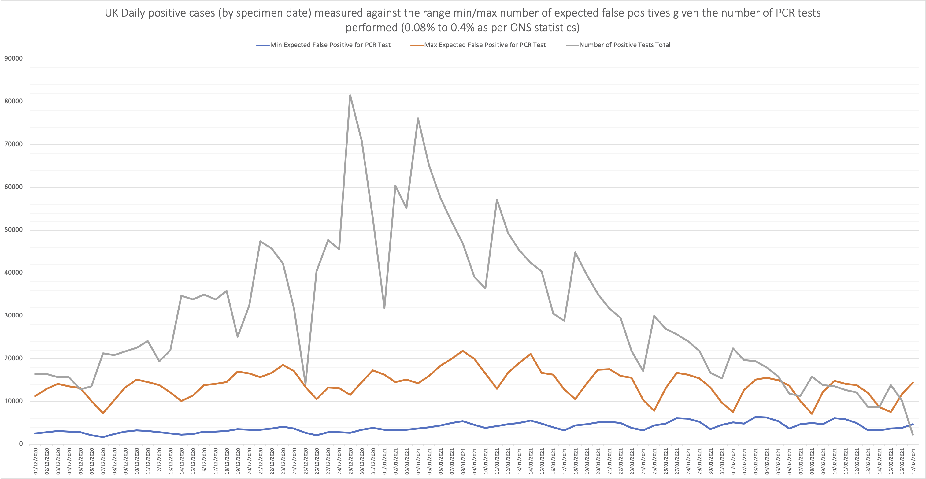
The simplest graph I’ve come up with is showing the number of positive results (in total), compared to the minimum and maximum number of expected false positives, given the number of PCR tests performed on each day.

I would take it with a grain of salt, seeing as there will obviously be a number of false negatives, although reports suggest that this rate is much lower then the false positive rate, and also with the dates not always lining up between a test being performed, results reported, and specimen date.
However, the assumption that the rate of false positives may have an affect on how we interpret the data looks to have a truth to it. So in respect to “the data”, I would suggest that COVID zero will never happen while we are performing ~500k tests a day, given the number of false positives.
Update:
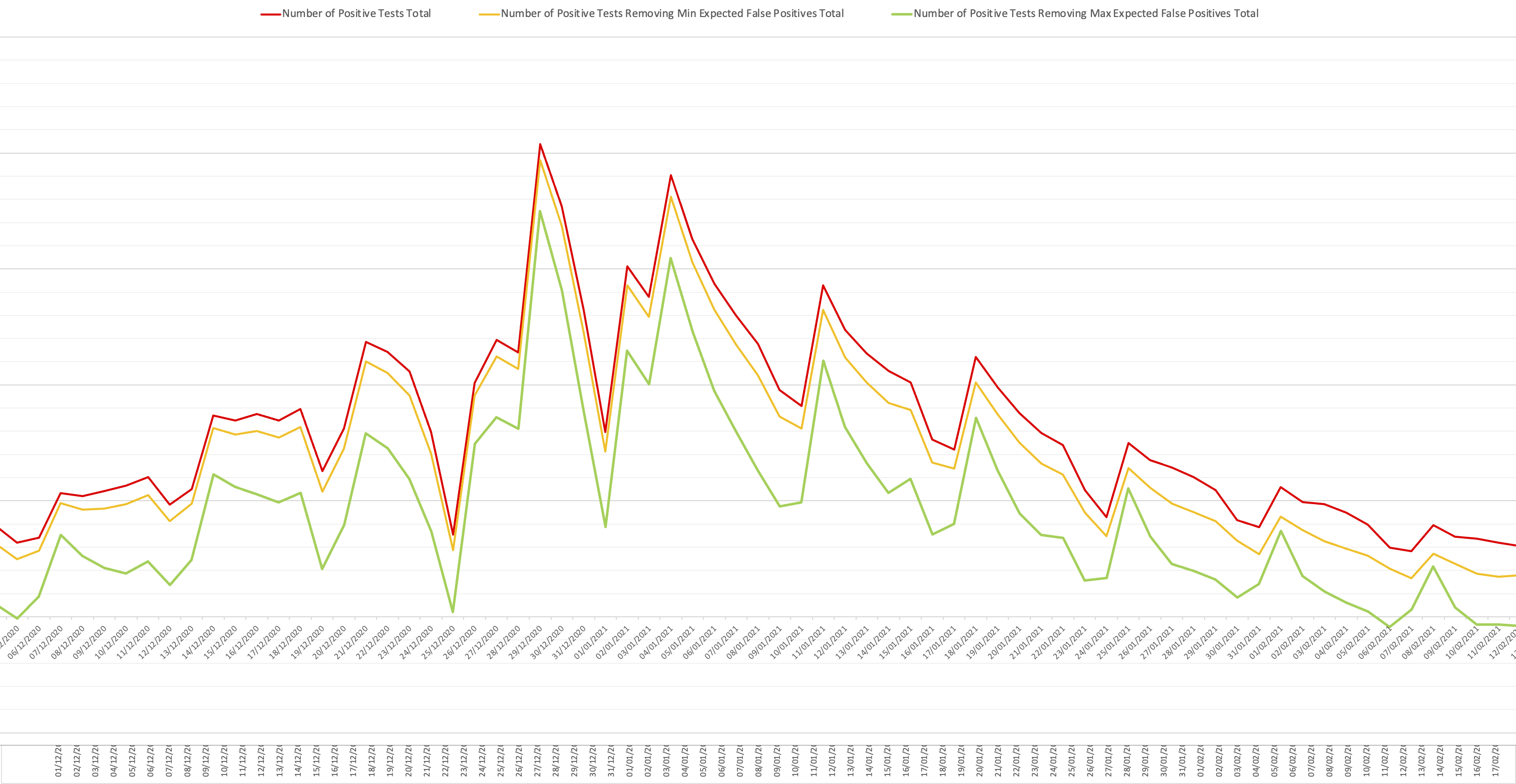
I have made a second graph which shows the overall positive number of cases in the UK per day, and also the same number of cases per day both removing the minimum and maximum number of expected false positives.

More salt is needed, but we’re certainly coming to an interesting point regarding the data.
I would also like to point out that I do not believe that number of positive cases should be the sole data point for restrictions, seeing as the number of deaths and hospitalisation rates are much more important. Because if you could remove the deaths and hospitalisation, then there would not be much risk left.